Luxury Student Living, Lancaster
We are often involved in commercial work in the local area. With a recent push from the council to encourage more purpose-built student accommodation we have seen an increase in custom from this area. It’s great to be able to be involved in such projects and it always amazes us to what high standards developers produce these builds. Lancaster itself is a historical city, with many of its original features still existing, Lancaster Castle for example, but it is a city that is also heavily influenced by the University and students. Quite often we find that student accommodation developers wish to retain as many traditional features of the buildings that they are developing as a subtle nod to their understanding of this historical city.
When work began on this particular development, we liaised with the team to find tiles suitable to compliment the original features they wished to retain. There was to be quite a bit of exposed brick work that would be worked into the design. There was also a requirement to have a slight industrial chic look to it, with an element of old meets new going on.
Bathrooms
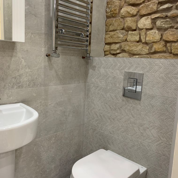
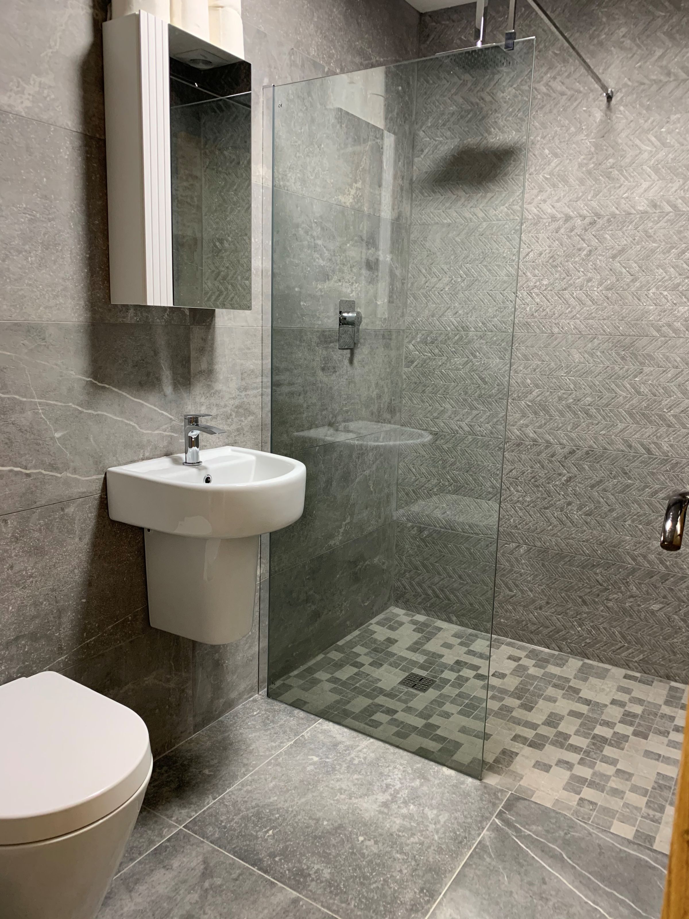
Bathrooms were tiled predominantly floor to ceiling apart from where the exposed brick was worked in. Nickon 40x120 cm was used on the majority of the walls with the corresponding chevron décor tile in the shower area. Nickon is a beautiful, mid grey, stone effect tile with eye catching white veining through it. The décor features a 3D, on trend chevron design with texture – perfect enough for any contemporary space but subtle enough to compliment traditional features. The bathroom floors are also tiled in Nickon, but the square floor tile of the collection, whilst the shower area floor has been tiled is a stone effect mosaic to allow for a wet room floor, eliminating the need for a shower tray.
Kitching & Living
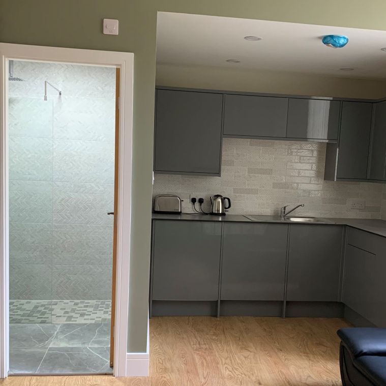
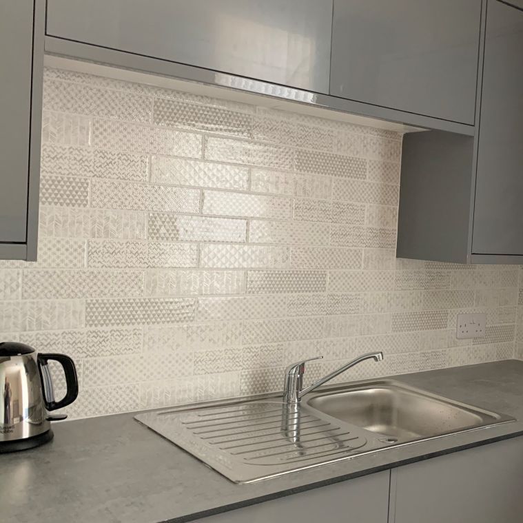
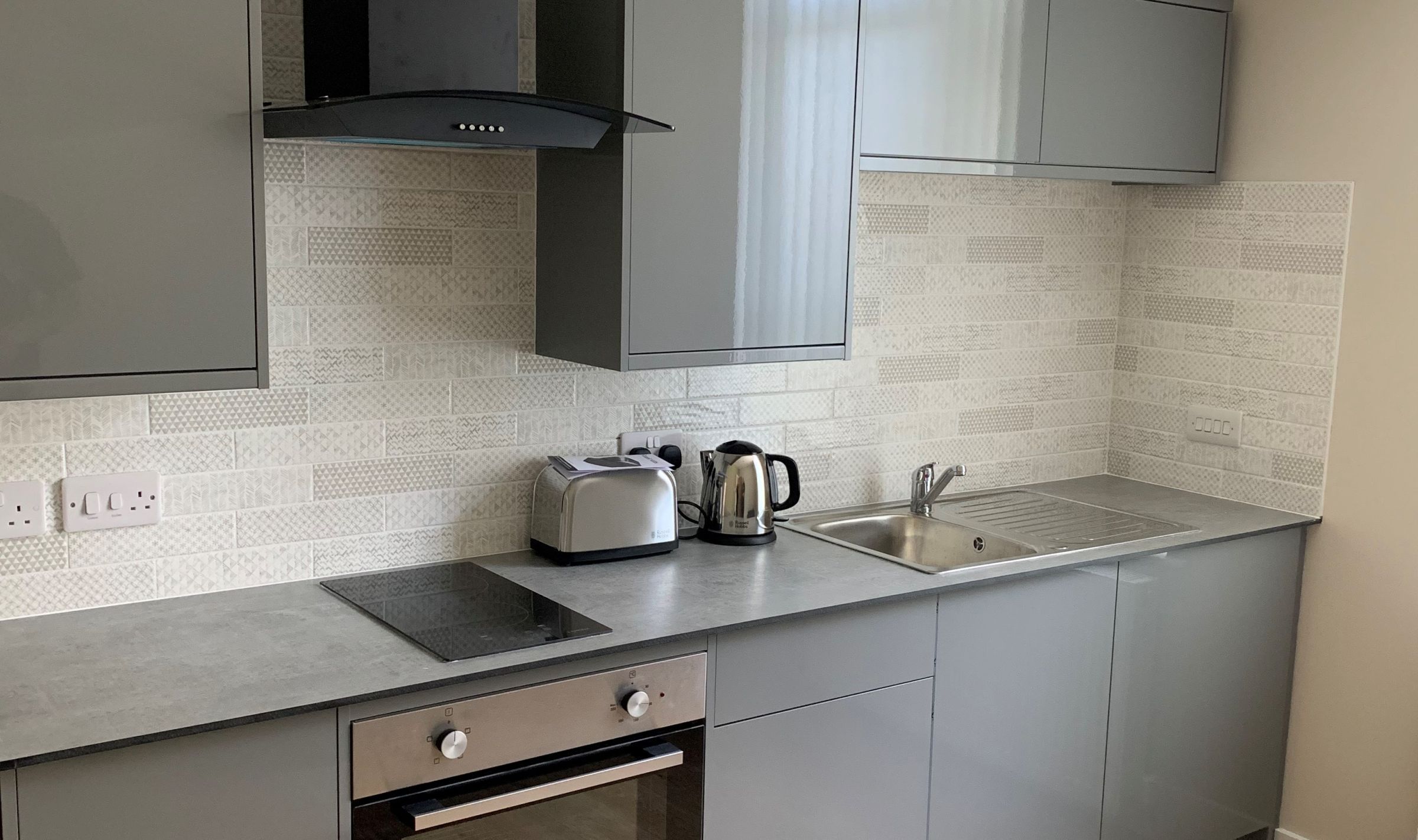
This build compromised of en-suite bedrooms with a communal living space and some studio apartments. The kitchen splashback area was tiled with a tasteful and neutral slim, rectangular tile with a subtle patterned design to it. Each tile bore a different pattern which created a kind of patchwork effect. The kitchen units were all dark grey and high gloss so the tiles chosen were a slightly off white with a greige pattern to them, plucking the grey of the units out quite nicely yet adding a brightness to the room.
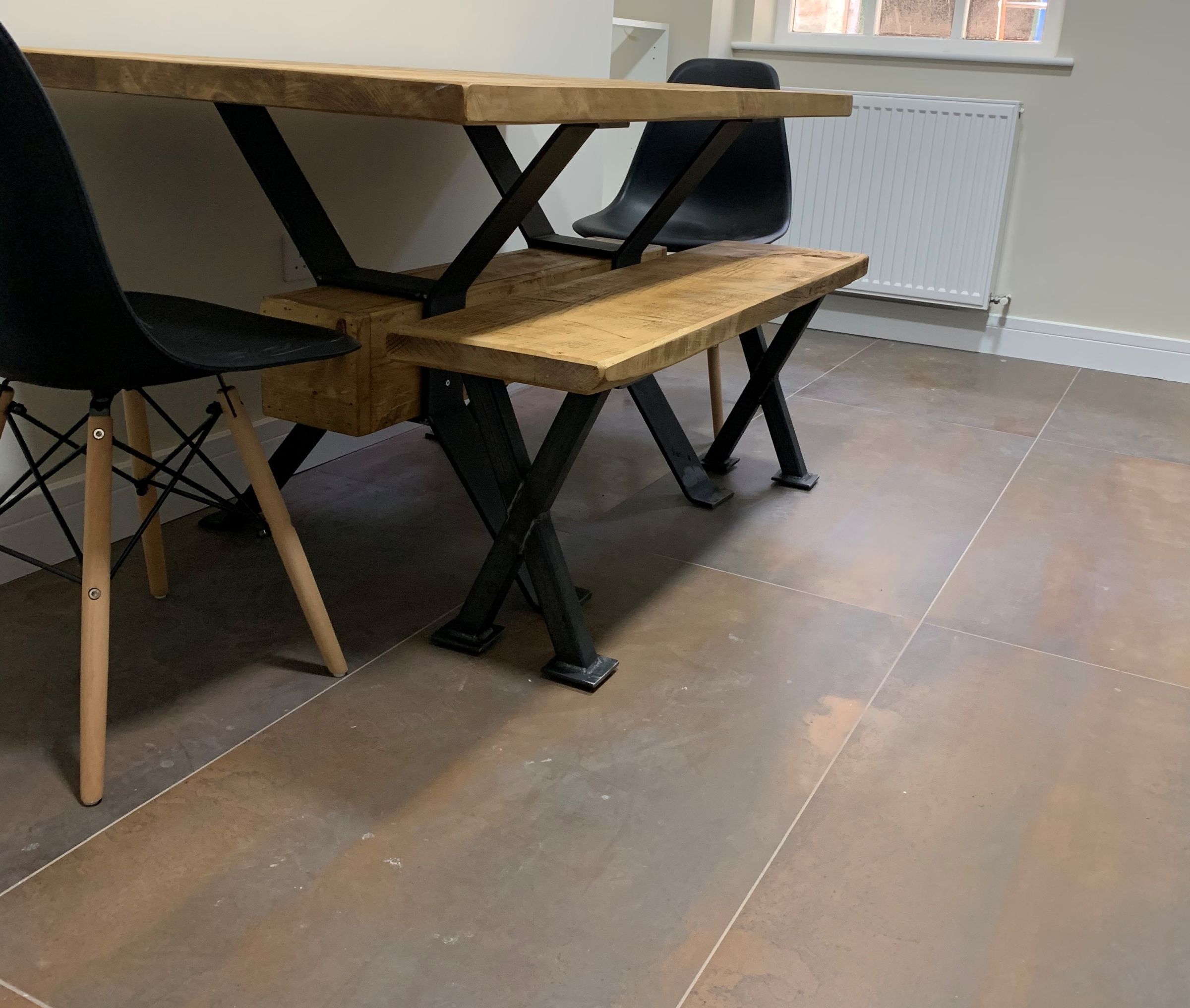
The communal living space floor was tiled in large format, industrial inspired tiles to ensure this high traffic area stood the test of time. Oxidatio Tellurium is a 60x120cm tile with a copper colourway and metallic tones perfect for complimenting the exposed, traditional stone and in keeping with the contemporary finish the developer was after.
Hallway
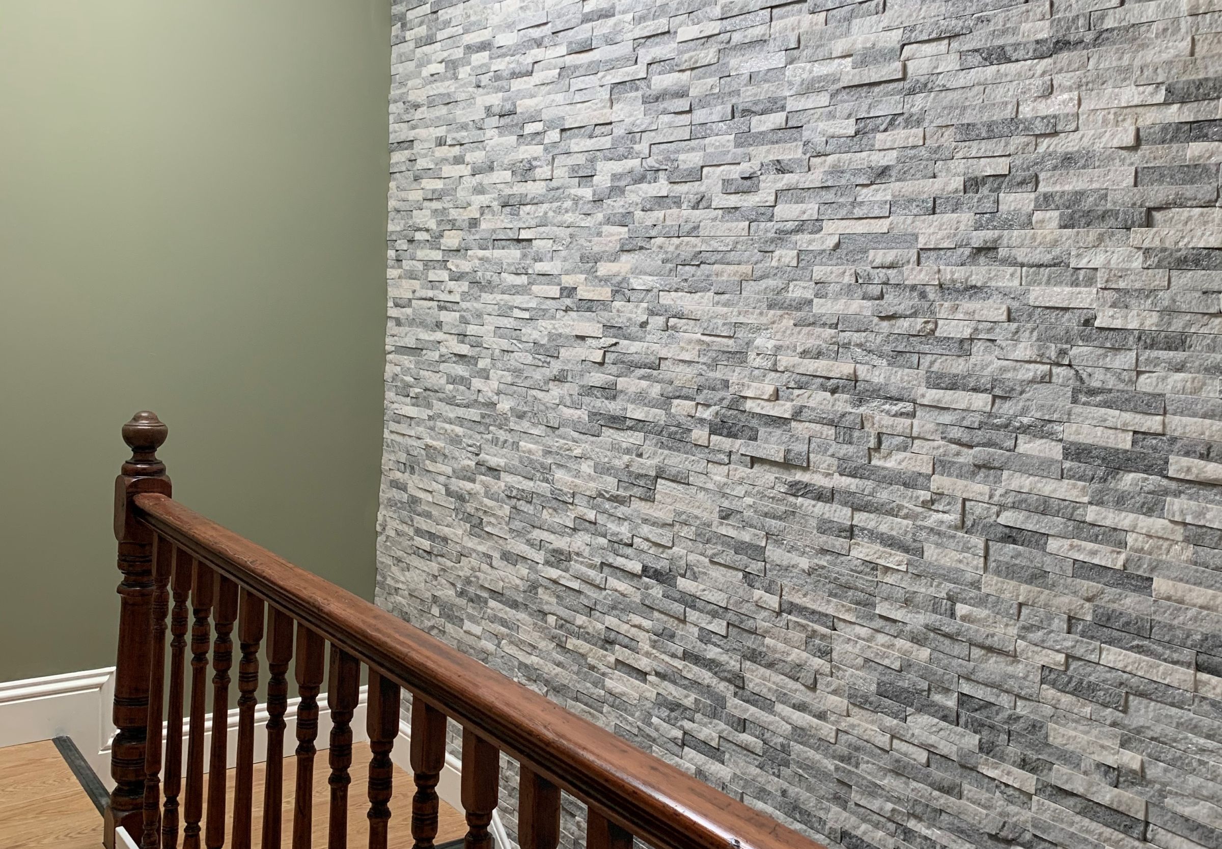
Finally, the staircase and hallway area had a feature wall of split face stone all the way up to the top. This not only added a fantastic feature to the staircase, but it reflects light all around the space from the skylight in the roof. A great addition to what could have been a very boring space. We are so thrilled to have been part of this student build and look forward to working with the developer again.
